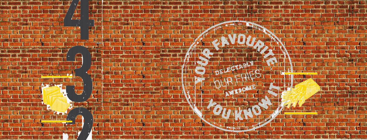
Graphics on the Existing BrickworkSelected graphic signage sign-written onto the existing brick wall, linking the original building to the refreshed brand.
Architecture, Interiors, Model Making & Furniture Design
Contemporary Hospitality Design
Hospitality interior design | Refurbishment | Brand refresh | Three-dimensional design | Revit documentation
A brand refresh that turned an existing café restaurant into a contemporary, welcoming place designed for a broad range of customers — families, teenagers and adults.
The design pairs a light-industrial character — timber, exposed brick and black detailing — with graphic artwork and bold colour. The result is modern and energetic, while staying cheerful, comfortable and easy to be in.
A restrained architectural palette forms the foundation: timber, brick, black metal and neutral surfaces. Colourful furniture, graphic artwork and patterned surfaces are layered over it to bring energy and personality.
The aim was an interior that works across generations — fresh enough to feel current, warm enough for families and everyday customers.
Graphics were treated as part of the interior rather than applied decoration. Large-scale artwork creates strong moments through the restaurant, and selected signage was sign-written directly onto the existing brickwork, connecting the original building with the new identity.
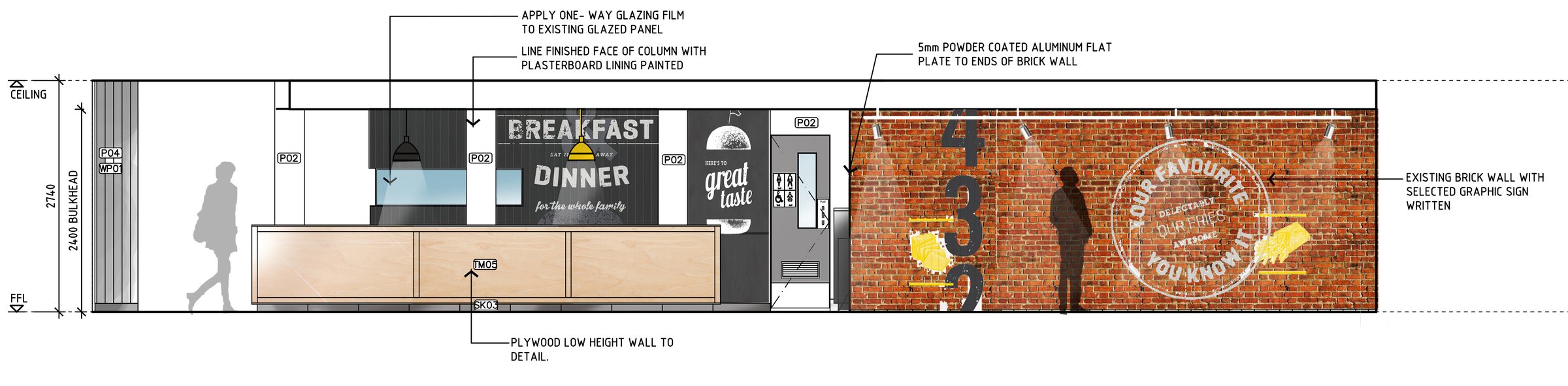
Internal ElevationCounter, graphic panels and the sign-written brick wall drawn together as one composition.
Smaller elements follow the same thinking. Removable menu boards hang from a square hollow section rail on hooks, set against a contrasting patterned backdrop — practical and easy to change, but still part of the interior’s character.
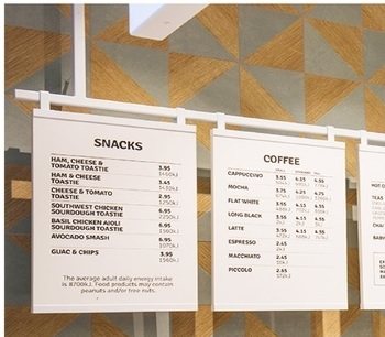
Menu DisplayRemovable boards suspended from a rail, with a patterned feature backdrop.
Timber brings warmth, the existing brick an established industrial character, and black metal a crisp contrast. The feature wall is lined in 150 mm VJ-groove plywood laid at a 15-degree angle and sealed in a clear satin two-pack finish — a simple material made more dynamic by the angle.
The overall planning provides a variety of dining settings to accommodate different customers and occasions. The restaurant includes areas for:
The variety of settings allows the restaurant to support different patterns of use rather than treating the entire space as one uniform dining environment. This creates a more flexible experience, allowing customers to find a setting that suits the occasion — from a quick café visit to a family meal or larger gathering.
Low-height walls were introduced around selected banquette seating areas to create a greater sense of privacy and comfort.
The banquette walls also help define the family dining areas without completely enclosing them from the wider restaurant. This creates a subtle separation between different groups while maintaining visual openness throughout the space.
The design therefore considers not only the appearance of the restaurant, but also the practical experience of families using the space.
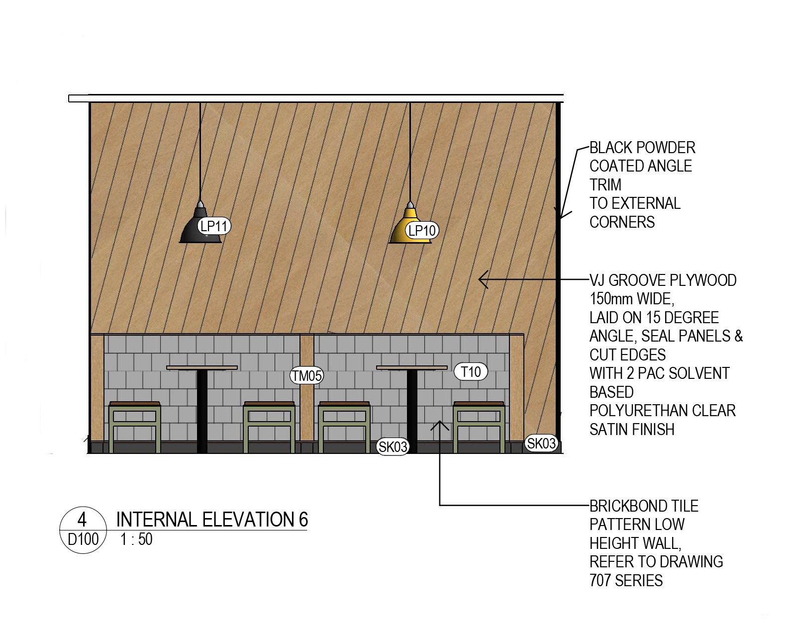
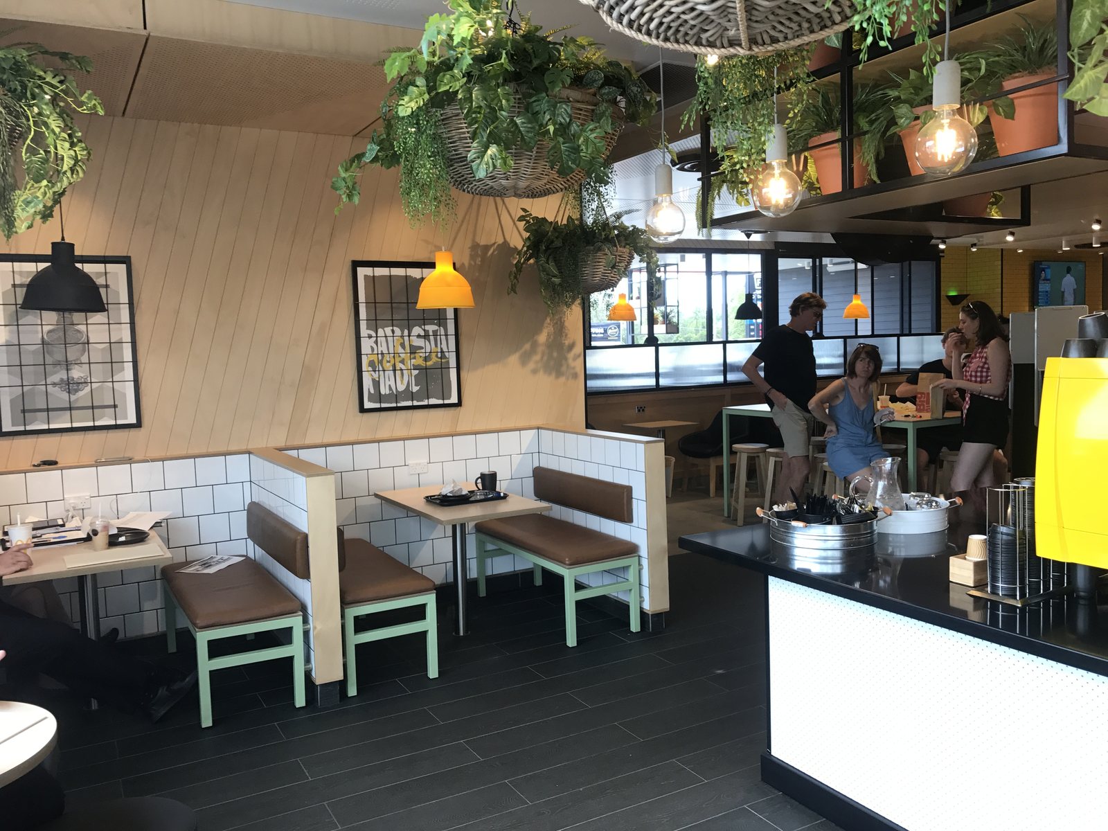
On Paper, Then BuiltThe banquette elevation as drawn, and the same wall completed — angled plywood, low tiled walls, pendants and seating.
The layout was developed in SketchUp, testing how dining areas, circulation, furniture and architectural elements work together as one space. The design was then carried into Revit documentation for construction.
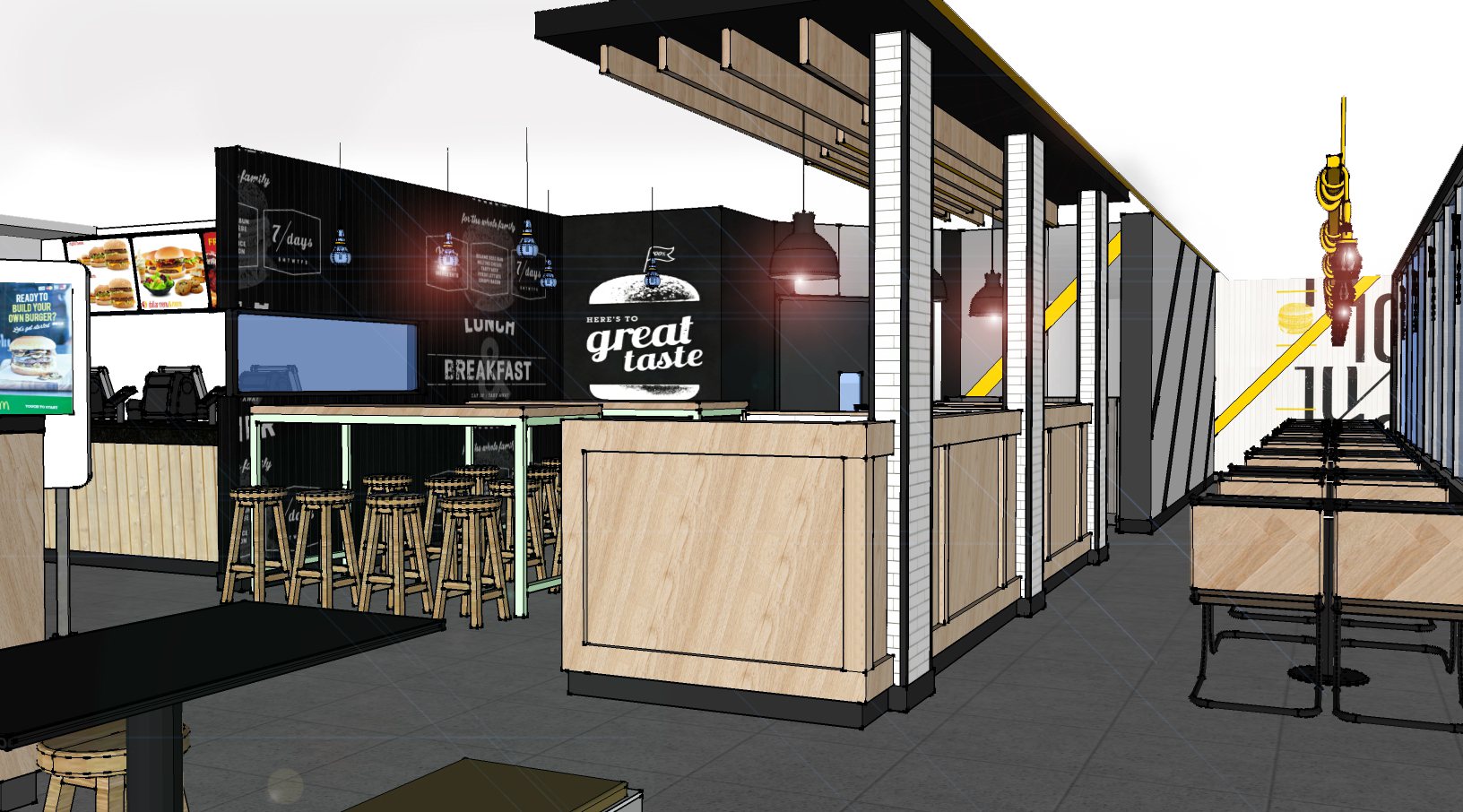
Three-Dimensional Design StudySketchUp study of the counter, dining areas and circulation.
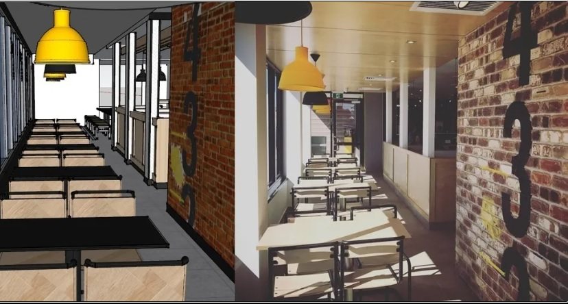
Study & Completed SpaceThe same view in SketchUp and as built — the window dining run beside the sign-written brick wall.
The finished restaurant brings the pieces together — timber, brick, graphics, colour, planting and a variety of places to sit. Rather than a formal dining room, it balances contemporary style with everyday ease: energetic and distinctive, but friendly and welcoming to everyone who comes through the door.
For enquiries, please get in touch through the contact page.